Customer Retention Analytics: Connect the Data Your CS Platform Can't See

Every account in your book of business has a health score. Most of them are green.
Then three customers churn in the same month and every one of them was green the week before they cancelled.
You pull up their history: support tickets were fine, logins looked normal, nobody flagged anything. But when you check Stripe, two of them had failed payments you never saw.
When you check product analytics, all three had stopped using the core feature six weeks ago.
Your health score was built from one signal. The combination that actually predicted churn — billing pattern, usage drop-off, and support sentiment changing together — was spread across four tools that never talked to each other.
Customer success analytics fails at the same place startup financial reporting fails: not at the dashboard, but where your systems are supposed to agree and don't. Your CS platform handles day-to-day ops like tasks, playbooks, health scoring from its own data. But the retention questions that matter most, "why do accounts actually churn," "which ones are about to," "what our NRR looks like by cohort over time," require connecting billing, product usage, support, and CRM data into a single picture your CS platform was never designed to produce.
This guide is the build order: what to decide first, what to connect second, and what you can skip entirely at your size.
One disclosure before we start: Definite is an all-in-one data platform, so we'll show each step working in Definite as the running example. The framework itself is tool-agnostic — you could execute it with a warehouse and a hired analyst. The argument of this post is that you shouldn't have to.
The framework in brief:
- Start from the retention decisions your CS team actually makes — which accounts to save, which to expand, what to present at the QBR — not from the data you happen to have.
- Build a health score from cross-system data: billing signals from Stripe, product usage from PostHog, support patterns from Intercom or Zendesk, and account context from HubSpot. A health score from a single source is a guess.
- Write a metric dictionary: NRR, logo retention, GRR, and health score defined once — so CS, finance, and the board are all looking at the same number.
- Map each metric to the source that answers it, and fix the places where they disagree. This is where CS analytics actually breaks.
- Build the dashboard last. Distribute alerts where CSMs actually work — Slack, email, your CS platform — not in a BI tool nobody opens.
- Set a review cadence: account-level risk weekly, cohort retention monthly, renewal pipeline quarterly.
Total time with modern tooling: a weekend to stand up. No data engineer, no warehouse project, no six-month implementation.
Why your CS platform can't show you churn
Before building anything, it helps to understand why your CS platform, whether it's Vitally, Gainsight, ChurnZero, or a homegrown setup, produces health scores that miss churn. It isn't a product failure. It's a structural one: CS platforms are built for day-to-day customer operations, not for cross-system analytical questions. Four mismatches explain why:
- Scope. Your CS platform sees support interactions and whatever in-app activity it tracks. But billing signals — payment failures, downgrade requests, declining MRR — live in Stripe. Product usage depth — feature adoption, session duration, engagement trends — lives in PostHog or Amplitude. Your CS platform has a partial picture, and it can't see the pieces it's missing.
- Scoring methodology. Most health scores in practice are rules-based — "if ticket count > 3, set to yellow" — and miss compound signals. A customer can be green on support and red on usage simultaneously. Some CS platforms now offer ML-based scoring, but even these are limited to the data the platform can see. The combination across systems is what predicts churn, and 45% of CSM-assigned health ratings contradict actual usage data.
- Identity. Stripe knows a
cus_ ID. Your CRM knows an account name. Intercom knows an email address. Your CS platform knows its own contact record. With no shared identifier across all four, "retention by segment" means a human matching records every month — and getting it wrong more often than they realize. - Grain. An Intercom conversation is not a Stripe subscription is not a PostHog event. Each system's rows represent different things. Combining them without aligning what each row means is how the same quarter produces three different churn numbers.
One CS leader we spoke with put it plainly: he was tackling churn — the highest-priority initiative at the company — and his first problem was that he was blind. Not because the data didn't exist, but because it was spread across systems that couldn't show him the correct way to look at it. His CS platform showed him day-to-day interactions. What he needed was cohort retention over time — logo, ARR gross, ARR net — and no single tool in his stack could produce it.
The practitioner skepticism about this is widespread. A ChurnZero study of 800 CS leaders found that 73% say their current health score doesn't reliably predict churn. Michael Goetz, a CS leader at Drata, put it more bluntly: health scores are horoscopes — vague enough to feel true, specific enough to be useless for actually predicting what happens next. He's not wrong about rules-based scoring from a single source. A health score built from cross-system data is a different instrument entirely.
Step 1: Start from the retention decisions, not the data
The oldest useful idea in measurement says you never start with available data — you start with the questions someone is actually going to ask. For a CS leader at a startup, those are:
- Which accounts are at risk of churning this quarter? The save-or-lose decision that drives every Monday's priority list.
- Which accounts are ready to expand? The growth signal your renewal pipeline depends on.
- What's our NRR, and is it trending up or down? The number the board asks about. The one you need to calculate the same way every time.
- Why did we lose the accounts we lost last quarter? The post-mortem that makes next quarter different.
- What should we present at the next QBR? The account-level story that keeps the customer engaged — backed by data, not by a CSM's gut feeling about how the relationship is going.
Notice what these questions have in common: none of them can be answered by a single data source. "At-risk accounts" requires billing + usage + support signals. "NRR by cohort" requires billing data matched to CRM segments. "Why did we lose them" requires connecting the cancellation event in Stripe to the support history in Intercom to the usage drop-off in PostHog.
And before any of these questions can be answered reliably, there's a harder question underneath: what counts as a customer? One executive at a company building their retention analytics framed it this way — is a churned customer someone who stopped paying for one month, or two months? Is a new customer measured from contract signature or first login? If CS, finance, and the board each answer these differently, every retention number is a disagreement waiting to happen. The metric dictionary in Step 3 solves this, but only if you've decided what you need to measure first.
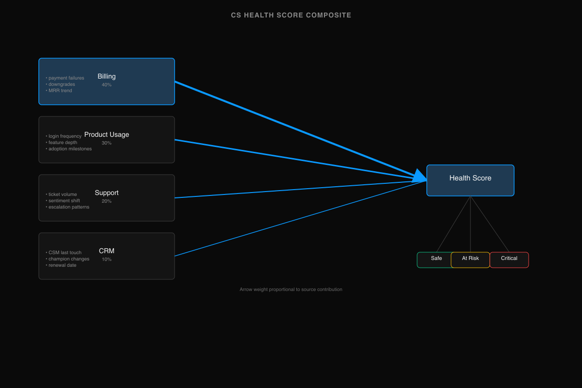
Step 2: Build a health score from all four sources
The technique that makes CS analytics work at a startup isn't a better algorithm — it's connecting data from four systems that each see part of the picture. Here's what each source reveals that the others can't:
| Source | Signal type | What it reveals | Weight |
|---|---|---|---|
| Billing (Stripe, Chargebee) | Payment failures, downgrades, contract end dates, MRR trend | Revenue risk — the most concrete lagging indicator of churn | Highest |
| Product usage (PostHog) | Login frequency, feature depth, session duration, adoption milestones | Engagement risk — often the strongest leading indicator, visible weeks before the customer says anything | High |
| Support (Intercom, Zendesk) | Ticket volume, sentiment shift, escalation patterns, resolution time | Satisfaction risk — qualitative signal that's hard to quantify alone | Medium |
| CRM (HubSpot, Salesforce) | CSM last touch, champion changes, stakeholder departures, renewal date | Relationship risk — context no automated system captures | Context |
A customer whose billing is healthy, usage is steady, support tickets are low, and CSM relationship is active is almost certainly safe. A customer whose usage dropped 40% six weeks ago, who just had a payment failure, and whose champion left the company? That's churn forming — and your CS platform, seeing only the support signal (which looks fine), keeps them green.
The CS leader who was building these cohort retention tables found the same thing: his CS platform worked for day-to-day interactions — tasks, playbooks, quick account checks — but for the lagging KPIs that the company and investors actually cared about, he needed a separate analytical layer that could see across all his data sources. It's the "day-to-day vs. lagging KPIs" distinction that most CS analytics guides skip entirely: your CS platform and your analytical layer do different jobs, and trying to make one do both is where the picture breaks.
Step 3: Write the metric dictionary
Every CS metric needs a single definition that CS, finance, and the board agree on. Without it, the most common failure mode is silent: your NRR number doesn't match the finance team's because you're counting churned customers differently, and nobody notices until a board meeting. The dictionary fixes this.
| Metric | Formula | Cut by | Source | Owner |
|---|---|---|---|---|
| Logo retention | (Customers at start − churned) / customers at start | Segment, cohort, CSM | CRM + Billing | CS lead |
| Gross revenue retention (GRR) | (Starting MRR − contraction − churn) / starting MRR | Segment, cohort | Billing | CS lead |
| Net revenue retention (NRR) | (Starting MRR − contraction − churn + expansion) / starting MRR | Segment, cohort, plan | Billing + CRM | CS lead / Finance |
| Health score | Composite: billing (40%) + usage (30%) + support (20%) + CRM (10%) | Account, segment | All four sources | CS lead |
| Time to value | Days from contract start to first activation milestone | Plan, segment | Product + Billing | CS lead |
| Expansion rate | % of accounts with ARR increase in period | Segment, plan, CSM | Billing + CRM | CS lead |
| CSM coverage | Active accounts / CSM headcount | Segment | CRM | CS lead |
The "Cut by" column is what separates a useful metric from a vanity number. NRR as a single company-wide figure is a board slide — and a 10-point NRR improvement translates to 20-30% valuation uplift, which makes getting this number right directly tied to your exit value. NRR by cohort vintage — showing whether each quarterly cohort retains better or worse than the one before — is the decision tool. NRR by segment shows whether your mid-market customers retain differently from your SMB customers, and whether your pricing tiers align with retention patterns.
The definitional question underneath the dictionary is harder than it looks. "What is a customer?" sounds simple until you realize Stripe has one answer (an entity with an active subscription), your CRM has another (an account with a signed contract), and your CS platform has a third (a contact who's been assigned a CSM). If a customer pauses their subscription for one month, did they churn? If they downgrade from annual to monthly, did they churn? The dictionary is where you write these answers down once — and the semantic layer is where you enforce them across every dashboard and query.
Step 4: Map your sources and make them agree
With definitions written, map each metric to the specific data source that can answer it and the join key that connects it to the others:
| Question | Source | Join key | Gotcha |
|---|---|---|---|
| Revenue churn this month? | Stripe subscriptions | customer_id → CRM account | Stripe subscription events vs. invoice events give different churn dates |
| Which accounts dropped usage? | PostHog events | User email → CRM contact → account | Anonymous sessions inflate usage numbers if not filtered |
| Support sentiment trending? | Intercom conversations | Contact email → CRM contact | Conversation volume ≠ severity — one escalation matters more than ten low-priority tickets |
| Renewal pipeline this quarter? | CRM opportunities | Account ID | Only useful if renewal dates are maintained — most CRMs have stale ones |
| NRR by cohort? | Stripe + CRM | customer_id → account → segment | Requires segment to be stable — a customer reclassified mid-period breaks the cohort |
The real work is in the join keys. Stripe's customer_id is opaque. PostHog tracks by user email or anonymous ID. Intercom tracks by contact. HubSpot tracks by company. Making "revenue by account" work across these systems means establishing an identity resolution layer — matching records across systems to a single account identity.
For most startups, this is the wall. One founder building analytics for their CS team described the experience: enabling tooling for customer success meant that a non-technical user needed to get insights from Postgres tables. That's the wrong abstraction — the CS team shouldn't need to know what a Postgres table is. The fix is a semantic layer that renames database columns to business terms ("stripe_mrr" becomes "Monthly Recurring Revenue"), resolves join keys automatically, and lets the CS team ask questions in their own vocabulary. The technical mapping between Stripe's cus_ ID and the CRM's account name happens underneath, invisible to the person asking the question.
Step 5: Build the dashboard last — distribute alerts where CSMs work
The dashboard is the least important part of this system. Not because it's unnecessary — a retention dashboard is genuinely useful for trend analysis and board reporting — but because CSMs don't work in dashboards. They work in Slack, email, their CS platform, and the CRM. If your retention analytics only exist in a BI tool that a CSM opens once a week, you've built a reporting system, not an early warning system.
Distribution is the unlock:
| What | Where | Frequency |
|---|---|---|
| Account moved from green to yellow/red | Slack channel #cs-alerts | Real-time |
| Payment failure on an account | Slack DM to assigned CSM | Real-time |
| Weekly book-of-business summary | Email to each CSM | Monday morning |
| Account-level health score changes | Pushed to HubSpot/Salesforce | Daily sync |
| Cohort retention trends | Churn dashboard, Retention dashboard | CS lead reviews weekly |
| Board-grade NRR + churn analysis | Customer success dashboard | Quarterly |
The dashboard pages — churn, retention, and customer success, each with source-specific views — exist for two audiences: the CS lead who reviews trends weekly, and the board who wants a quarterly retention picture. For everyone else — the CSMs doing the actual account work — the value is in the alerts and summaries that show up where they already are.
Step 6: Weekly review cadence
The system above produces data. Cadence turns data into decisions.
| Cadence | What | Who | Action |
|---|---|---|---|
| Weekly | Account-level health score changes — new at-risk accounts, accounts recovered, expansion signals | CS lead + CSMs | Prioritize outreach, assign saves, queue expansion conversations |
| Monthly | Cohort retention analysis — logo, GRR, NRR by cohort vintage | CS lead | Identify trends: are newer cohorts retaining better? Is a specific segment churning faster? Adjust onboarding or pricing. |
| Quarterly | Full retention review — NRR trend, churn reasons (categorized), expansion pipeline, QBR prep | CS lead + exec team | Board-grade reporting. Churn post-mortem: tag every lost account with a primary reason, look for patterns. Feed the renewal pipeline forecast. |
The weekly review is the working view — it should take 30 minutes, not a morning. The monthly cohort analysis is where the real insight lives: a cohort retention table that shows logo, ARR gross, and ARR net by quarterly cohort, going back at least four quarters. If Q1 2025 cohort retains at 95% after twelve months but Q3 2025 cohort retains at 85% after six months, something changed in the product, the onboarding, or the customer mix — and you can see it before it hits the company-wide NRR number.
The quarterly review is what you bring to the board and what you prepare for QBRs. It answers: "How is retention, and why?" Not with a single NRR number, but with the decomposition underneath it — which segments, which cohorts, which specific accounts drove the change.
AI retention analytics: the startup version is a different problem
Search "AI churn prediction" and everything you'll find assumes enterprise scale — thousands or millions of accounts, ML models trained on historical patterns, propensity-to-churn scores. That's real and useful if you're a telco with ten million subscribers. But full ML churn prediction requires more data than most early-stage startups have — logistic regression can work on smaller datasets, but gradient-boost models need hundreds of churn events to train reliably. And frankly, at 200 accounts, you know most of them by name.
The startup version of AI retention analytics is simpler and more useful: AI as the analyst who connects your four data sources and surfaces the patterns you'd catch yourself if you had time to look.
That means natural language queries: "Which accounts dropped usage by more than 30% this month and have a renewal in the next 90 days?" — a question that requires joining PostHog usage data to Stripe subscription data to CRM renewal dates. Without AI, that's a data request to engineering. With AI that understands your metric dictionary and source mapping, it's a question you ask on Monday morning.
It means anomaly detection: flagging when billing, usage, and support signals diverge for the same account — payment is current but usage flatlined, or usage is strong but support tickets spiked. These compound patterns are what rules-based health scores miss, and they're exactly what a model pointed at cross-system data catches.
But the condition that enterprise AI content never has to spell out: AI is only as reliable as the definitions underneath it. Pointed at four systems that disagree on what a customer is, AI confidently produces wrong numbers faster. Pointed at a metric dictionary over joined data, it does the work of the analyst you never hired. Steps 1–4 of this guide are, concretely, how you make AI retention analytics trustworthy.
Doing this with Definite
Definite is the system above, packaged. You get 500+ connectors — Stripe, Intercom, Zendesk, HubSpot, PostHog, and every major CS data source — with storage and modeling included. Your metric dictionary is implemented as governed definitions: NRR, health score, and churn calculated the same way in every dashboard, every query, every alert. Fi, the AI analyst, answers CS questions in plain English — from those definitions, with inspectable SQL underneath.
Alerts push to Slack when a health score changes. Weekly summaries go to email. The churn, retention, and customer success dashboards give you the cohort retention views the board asks about. And Definite sits beside your CS platform — your CS tool handles day-to-day playbooks and tasks, Definite handles the analytical layer that connects everything. Pricing is one flat platform fee — $250/month, unlimited users (pricing).
If you'd rather assemble it yourself: a warehouse, an ingestion tool, a modeling layer, a BI tool, and the time to make them agree. The framework in this guide works either way. One of them is a weekend.
→ More on the CS setup specifically: Definite for Customer Success teams.
FAQ
What's the difference between logo retention and net revenue retention? Logo retention is the percentage of customers you kept — it treats every customer equally. NRR weights by revenue and includes expansion: you can lose customers and still grow NRR if the remaining ones expand. You need both. Logo shows the breadth of your retention problem; NRR shows the revenue impact. A company with 90% logo retention and 120% NRR is losing small accounts and growing large ones — that's a very different situation from 90% logo and 95% NRR.
How do I build a health score that actually predicts churn? Connect four data sources — billing (Stripe), product usage (PostHog), support (Intercom or Zendesk), and CRM (HubSpot). Weight billing signals heaviest: payment failures and downgrade requests are the strongest churn predictors. Rules-based scores from a single source miss compound signals — a customer can look healthy in your CS platform while their billing and usage tell a different story.
Do I need a data team for customer retention analytics? No. An all-in-one data platform like Definite connects sources and defines metrics without SQL or data engineering. The framework in this guide can be set up in a weekend — connect your data sources, define your metrics once, and start getting answers. The assembled warehouse-and-pipelines approach is what you build when you have a data team that wants to own infrastructure.
How is this different from what my CS platform already does? CS platforms — Vitally, Gainsight, ChurnZero — handle day-to-day ops: playbooks, tasks, in-app health scoring from their own data. They're essential tools. But they see a partial picture: whatever data they ingest natively. An analytical layer connects all your data sources for the retention questions your CS platform can't answer: cross-system health scores, cohort retention analysis by vintage, board-grade NRR that matches what finance reports. Think of it as your CS platform for the operational layer, the analytical platform for the strategic layer.
What metrics should a VP of Customer Success track? Start with the dictionary in Step 3: NRR, logo retention, GRR, health score, expansion rate, time to value, and CSM coverage. NRR is what the board cares about. Logo retention is what tells you how many customers you're actually keeping. Health score is what lets you act before churn happens. The dictionary defines each with formulas and the dimensions you should cut them by — by segment, by cohort, by CSM — so the numbers tell you where to focus, not just whether things are good.
If you're looking at the metrics themselves — what to track and how to report to the board — see our investor reporting guide. For the financial layer of this system, see the startup finance analytics guide. For the revenue pipeline that feeds retention, see the RevOps analytics guide and the marketing analytics guide. For the dashboard structure that holds all of it, see the executive dashboard guide.
The framework is the starting point. Start building yours →