Stop Building KPI Lists. Build a Dashboard Tree.

Someone on your team says "we need a KPI dashboard." You search for one, find a template with 15 metrics in a grid, and customize it for your business. Revenue, burn rate, pipeline, conversion rate — all in one view. Problem solved.
Six months later you have 40 dashboards. Marketing has three. Sales has five. Finance has a "board version" and an "internal version" that don't agree. Every new question — "what's our CAC by channel?" or "why did churn spike?" — triggers a request for another dashboard. You're the bottleneck, and you realize the dashboards have the same problem the spreadsheets had: nobody knows where to look, and nobody trusts that any single view tells the whole story.
The problem isn't the metrics you picked. It's that you built a list when you needed a tree.
Executive dashboards work when they mirror your org chart — a hub at the top routing to category dashboards for each functional area (finance, sales, marketing, product, support), each routing to connector-specific views that answer "why." This structure eliminates dashboard sprawl: adding a new data source creates a new leaf on an existing tree, not a new project. Board questions become navigation, not excavation. And every metric traces back to a single definition, so your finance numbers and your board deck always agree.
KPI Lists are Simple (Maybe Too Simple)
Every "KPI dashboard" guide on the internet gives you the same advice: pick 5-7 KPIs, put them on a single screen, review weekly. This is fine when you're three people and your whole business fits in one view.
It stops working the moment your company has departments.
The VP of Sales needs pipeline velocity by rep. Your head of marketing needs attribution by channel. Finance needs cash flow projections alongside AR aging. None of these belong on the CEO dashboard — they'd clutter the view — but they all need to exist somewhere, connected to the same underlying data.
Without a structure to hold them, each request becomes a one-off project. Someone builds a dashboard in isolation, defines metrics their own way, and shares it with their team. The marketing conversion rate doesn't match the sales conversion rate because they're counting different things. The revenue number on the CEO dashboard doesn't match the revenue number in the finance dashboard because one pulls from Stripe and the other from QuickBooks.
This is dashboard sprawl. An Atlan survey found that 43% of dashboard users skip their reports entirely and do their own spreadsheet analysis instead. Organizations with 500+ dashboards carry 30-40% redundancy — nearly a third of the work was wasted.
The pattern scales predictably: Flexport, the logistics company, grew to 2,700 dashboards before Abhi Sivasailam restructured them into roughly 60 — organized as a bounded, cascading hierarchy. You don't need 2,700 dashboards to feel the pain. You feel it at 15.
Why "pick the right KPIs" misses the point
The advice isn't wrong — it's incomplete. Choosing which metrics to track is the easy part. The hard part is how they relate to each other and who owns them.
Revenue on a CEO dashboard is a summary. When the board asks "why is revenue down 12% this quarter," the CEO dashboard can't answer that. You need to navigate — was it churn (finance), pipeline slippage (sales), or a drop in qualified leads (marketing)? Each answer lives in a different functional area, and each area's answer depends on data from a specific source.
A flat list of KPIs has no navigation. Revenue is a number, not a doorway. When someone asks "why," you open a spreadsheet.
Your Reporting Structure Is Your Dashboard Architecture
Here's the insight that changes how you think about dashboards: every functional area that reports to you is a branch of a tree. Finance, sales, marketing, product, support — each one has its own data sources, its own questions, and its own people who need answers. The CEO's job is to see across all of them without drowning in any one.
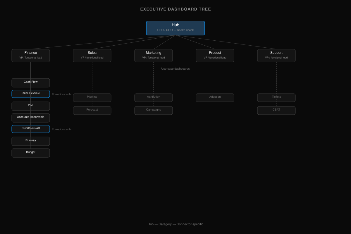
That maps directly to a three-level dashboard hierarchy — the minimum viable tree for most growing companies:
| Level | Who sees it | What it shows | Updates |
|---|---|---|---|
| Hub | CEO / COO | One summary per functional area — the health check | Daily or real-time |
| Category | VP / functional lead | Use-case dashboards within their area | Daily |
| Connector-specific | Ops person / analyst | Data-source-level detail answering "why" | Real-time from source |
When the board asks "how's the pipeline?" you don't build a new dashboard. You navigate: hub → sales category → pipeline dashboard → HubSpot pipeline view. The answer exists. It was always there. You just needed a structure that makes it findable.
This isn't theoretical. Flexport validated this approach at enterprise scale — reducing 2,700 dashboards to roughly 60 by organizing them as a bounded hierarchy of goals, success factors, and supporting metrics. We built Definite's dashboard library with the same structure — 29 use-case dashboards organized into six categories, each with connector-specific variants that go as deep as the data source allows. The library has 93 pages, but navigating it feels like three clicks.
One Branch, Top to Bottom
The tree makes more sense as a walk-through than as a list. Take finance — the branch every CEO cares about first.
At the hub, you see one number: revenue trend. MRR is up, down, or flat. That's it. The hub doesn't tell you why. It tells you where to look.
At the category level, the finance branch fans out into the views your finance lead actually works in: cash flow, P&L, accounts receivable, runway, budget. Each one is a use case, not a data source. Your CFO doesn't think in terms of "the Stripe dashboard" — they think in terms of "do we have the cash to make payroll in three months?"
At the connector-specific level, the finance dashboards break down by source. Revenue comes from Stripe revenue. AR aging comes from QuickBooks accounts receivable. If your CFO says "the revenue number doesn't match what I see in Stripe," you don't debug — you navigate to the Stripe view and compare. The dashboard IS the Stripe data, governed by the same metric definition as the category view above it.
The board asks "why is revenue down 12% this quarter?" You don't open a spreadsheet. You navigate: hub → finance → Stripe revenue → and see that three annual contracts churned in the same week. The answer was already in the tree. You just needed a structure that made it findable.
The same pattern repeats for every functional area — sales and marketing and product each have their own category dashboards fanning out to connector-specific leaves. (Definite's dashboard library maps the full tree: 29 use-case dashboards across six categories, each with connector-specific variants — 93 pages total, navigable in three clicks.) But the structure is always the same: hub → category → source. One deep branch teaches you the whole tree.
The Tree Tells You Where to Look. The Semantic Layer Tells You What You're Looking At.
The tree solves navigation. But navigation without trust is just faster confusion.
Revenue means one thing in Stripe (collected), another in your CRM (booked), and another in QuickBooks (recognized). Someone on the sales team redefines "active customer" in their pipeline dashboard, and nobody notices for three months — until the board deck contradicts the finance report and you spend a Sunday night figuring out which number is real.
A Precisely survey found that 67% of organizations don't trust their data for decision-making, up from 55% the year before. The problem isn't the data. It's that the same metric means different things in different places.
The fix is a semantic layer — a single place where each metric is defined once. "Revenue" is defined as a specific calculation over a specific source, and every dashboard that shows revenue uses that definition. When the board asks "is that net or gross?" the answer is the same everywhere, because there's only one definition.
This is what separates a dashboard tree from a collection of dashboards that happen to look organized. The tree handles navigation — where do I go to answer this question? The semantic layer handles trust — can I believe the number when I get there? You need both. And in practice, the semantic layer comes first — because a tree built on inconsistent definitions is just organized chaos.
Building Your Tree
With shared definitions in place, building is bottom-up — start from your data sources, not from a template.
Most startups have 3-7 data sources: a billing system (Stripe, Chargebee), a CRM (HubSpot, Salesforce, Pipedrive), an accounting tool (QuickBooks), maybe a product analytics platform and an ad platform. Each one maps naturally to a functional area. Stripe → Finance. HubSpot → Sales + Marketing. QuickBooks → Finance. The mapping is usually obvious.
Start with one leaf. Build a Stripe revenue dashboard. It's small, it's verifiable against what you already see in Stripe, and it's immediately useful. Then build the revenue category dashboard that aggregates across billing sources. Then add the revenue summary to the hub.
Bottom-up works because each leaf is independently useful. Your finance lead can use the Stripe revenue view before the hub exists. The tree composes naturally as you add sources — build the branches you have data for, add more as you grow. A seed-stage startup with Stripe, HubSpot, and QuickBooks ends up with roughly 10-12 dashboards. That's the whole tree. It grows structurally as you add data sources and departments, not by sprawl.
Why the Tree Is the Foundation for Everything That Comes Next
The basic tree — hub, categories, connector-specific views — handles 80% of the questions a growing company asks. But the questions get harder.
"Show me revenue by marketing channel by product line." That's finance × marketing × product — three branches at once. A drill-down path can't answer it. You need a cross-functional query layer that understands all three data sources and their relationships. That's possible only if the tree's branches share a semantic layer — if "revenue" means the same thing in the finance branch as it does in the marketing branch.
"Push churn risk scores into HubSpot so my CS team gets alerted before renewal." That's the tree talking back to the operational tools — computed metrics flowing from the analytical layer into the systems where your team actually works. Dashboards become inputs to workflows, not just outputs to screens.
"Hey Fi, why did CAC spike last month?" An AI analyst can answer this — but only if it knows where CAC lives (the marketing branch), how it's defined (the semantic layer), and where to drill for detail (the connector-specific leaves). The tree gives AI the same navigation structure it gives humans. Without it, AI is guessing which data source to query and how to define the metric — the same ambiguity that causes dashboard sprawl in the first place.
None of these are possible on a flat list of KPIs. Cross-functional queries require shared definitions across branches. Operational workflows require governed metrics that systems can trust. AI requires structured context. The tree isn't just organizational hygiene — it's the architecture that makes everything after it work.
That's the real reason to start here, even if you're only three people and your whole business fits on one screen today. The tree is trivial to build now and expensive to retrofit later. The flat list is the opposite.
If you're looking for the metrics themselves — what to track at each stage — our investor reporting guide covers the numbers. For the finance branch, see the startup finance analytics guide. For sales and marketing, see the marketing analytics and RevOps analytics guides.
The tree is the foundation. Start building yours →