Data Apps: When Standard Dashboards Can't Build What You Actually Need
Standard BI tools default to pre-built chart types and dropdown filters. When you need something custom — a basketball shot chart with player filtering, an animated shot sequence, a visualization that doesn't exist in any tool's widget library — you're either building a standalone app from scratch or maintaining a Python server in Streamlit.
In this post, I'll walk through a pipeline I used to build an interactive NBA game day recap app: pulling data from an external API, loading it into a warehouse, and having AI generate a fully interactive data app — all from natural language prompts. The walkthrough uses Definite. The underlying pattern — API ingestion, warehouse storage, AI-generated frontend — is a general architecture, but Definite collapses it into a single platform. Here's what we'll cover:
- What data apps are and how they differ from standard dashboards
- The three-step pipeline: MCP pulls external data → DuckLake stores it → Fi builds the interactive app
- A live walkthrough of the finished app: shot charts, animations, player stats, and instant client-side interactions
- When to use data apps vs. standard dashboards
Why Data Apps Exist (and When Dashboards Aren't Enough)
Data apps are interactive dashboards that run entirely in the browser. They load query results into DuckDB WASM — a database engine running client-side — so filtering, pivoting, and drilling down happen with no server round-trips. After the initial data load, every interaction is instant.
Fi, Definite's AI agent, generates the full HTML — Tailwind CSS, Chart.js, custom canvas logic, or libraries like D3, ECharts, and Perspective.js. Because Fi generates the source, you get pixel-level control. You can edit the code directly or keep iterating with natural language prompts. The tradeoff: data apps show a snapshot of data at build time (refreshable on demand), while standard dashboards pull live data on every load.
The Pipeline: API → Warehouse → Interactive App
Here's the three-step process I used to build the NBA game day app. The concept — pull data from an API, load it into a warehouse, build a frontend with AI — works with any data source you can call from Python.
Step 1: Pull external data with MCP
MCP (Model Context Protocol) is an open standard introduced by Anthropic for connecting AI models to external tools and data sources. Most MCP content focuses on querying existing databases. But Definite's MCP server also exposes tools for managing integrations, executing Python, and writing data back to the warehouse — which means it doubles as a data ingestion pipeline, not just a query interface.
Here's the prompt I gave Fi:
Use the NBA API to pull play-by-play data and player game logs for March 10th, 2026 and store it in DuckLake under a new schema called NBA_Demo_2.
Fi wrote and executed a Python pipeline that:
- Called the NBA API (via the
nba_apiPython package) to find all 11 games played on March 10th, 2026 - Fetched play-by-play data for each game — about 9,700 events total — with rate-limiting delays between API calls
- Loaded the data into DuckLake — Definite's managed data warehouse built on DuckDB and Iceberg, which stores data as Parquet files with full ACID transactions
The whole process took about a minute. I didn't write any code — Fi generated the Python, executed it, and loaded the results.
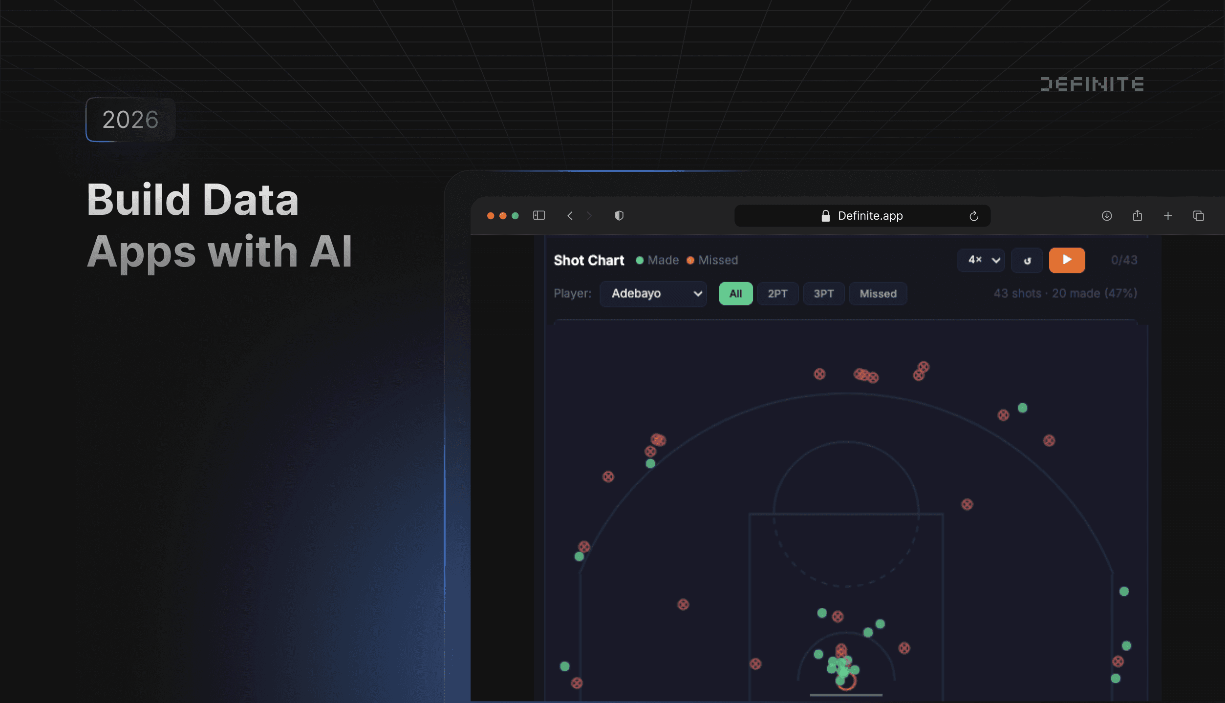
I picked March 10th specifically because it's the night Bam Adebayo scored 83 points for the Miami Heat — which makes for a much more interesting demo than a random Tuesday in February.
Step 2: Build the data app with Fi
With the data loaded, I asked Fi to build the app:
Build me a game day recap data app for March 10th, 2026. I want game score cards at the top, a shot chart plotted on a basketball court, game flow timelines, quarter scoring, team shooting comparisons, a shot type breakdown, and a top scorers table with a player performance bubble chart. Dark theme, use Chart.js for charts, Tailwind for styling.
Fi generated a single HTML file that includes:
- Tailwind CSS + Chart.js loaded from CDN for styling and standard charts
Definite.query()calls that fetch data from DuckLake, with results cached locally for instant subsequent loads- Custom canvas logic that draws a basketball court and plots shot locations
- Team color mapping for all 30 NBA teams
- Interactive state management — selected game, shot filters, player filters, timeline toggles
The app rendered inside a Definite Doc. It wasn't perfect on the first pass — the team color mapping was off for a couple of teams and the shot chart coordinates needed adjusting. I told Fi to fix both and it corrected them in seconds. That's the real workflow: prompt, review, correct, iterate. For large datasets (100K+ rows), a faster transfer protocol based on Apache Arrow handles the load efficiently.
Step 3: Iterate by asking follow-up questions
The base app was solid, but I wanted one more thing — an animated shot sequence. So I asked:
Add a shot sequence strip below the shot chart. Show every shot as a colored dot in chronological order: green for 2PT made, yellow for 3PT made, red outline for misses. Group by quarter. Add a play button that animates through the shots one by one, highlighting each on the court.
Fi added the visualization. No manual code edits. This is the iterative pattern: start with a base app, add features conversationally, and refine until it does exactly what you need.
The Result: 11 Games, Shot-by-Shot Animation, Zero Code
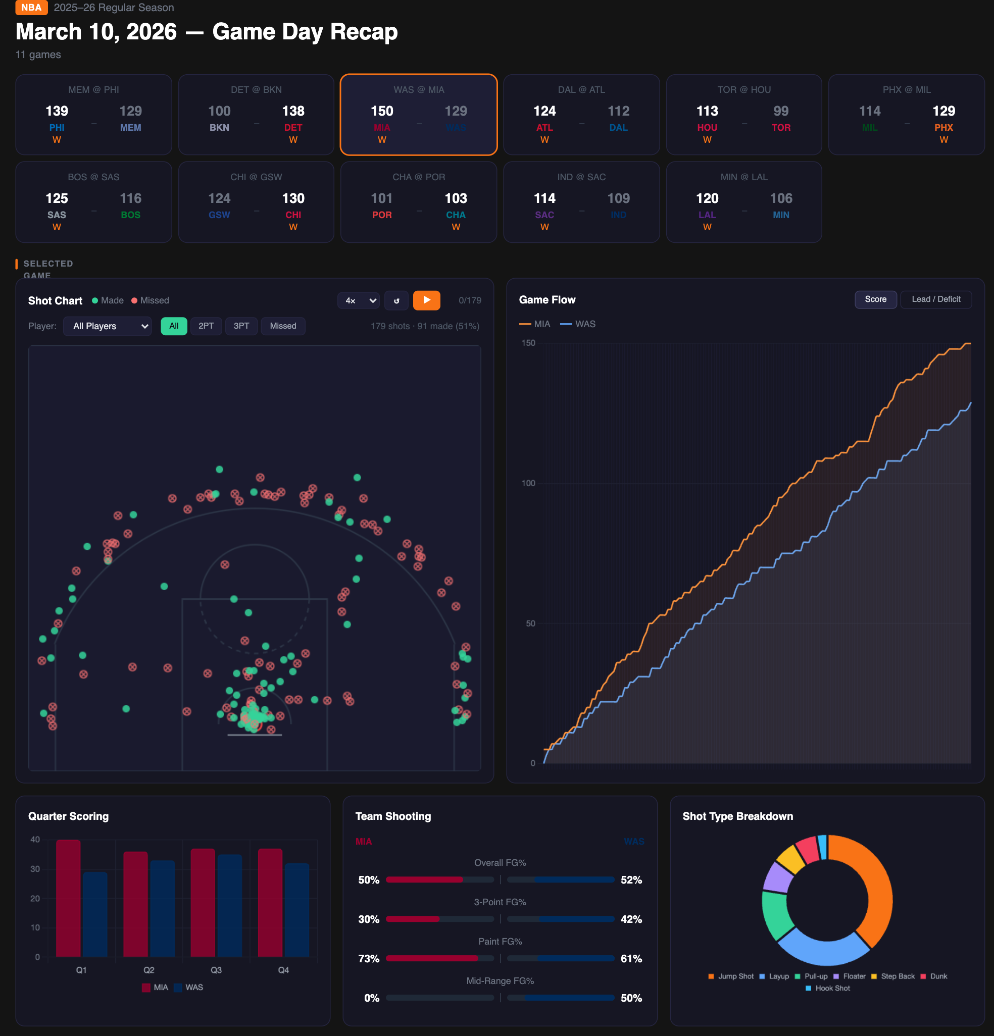
Here's what the NBA Game Day Recap app includes:
Game cards — Every game from March 10th, displayed with team colors and final scores. Click any game card and the entire app updates instantly.
Interactive shot chart — A basketball court with every field goal attempt plotted. Green dots for makes, red X's for misses. Filter by player (select Bam Adebayo and see all 43 of his field goal attempts), by shot type (2PT, 3PT), or by result (makes vs. misses). Every filter is instant.
Shot sequence animation — Each shot displayed as a colored dot in chronological order, grouped by quarter. Hit play and watch the shots animate onto the court one by one. You can watch Bam's entire 83-point game unfold shot by shot.
Game flow timeline — Score progression throughout the game, with the option to toggle between raw score and lead/deficit views.
Player stats — Top scorers table, bubble chart (points vs. assists, bubble size = rebounds), and team shooting comparisons.
After the initial data load, every interaction is instant — all filtering and rendering happens client-side in the browser.
What About Real-World Data?
The NBA API is clean, well-structured data — ideal for a demo, but not representative of most production environments. If you're connecting a Postgres database with hundreds of tables and inconsistent naming, the experience will look different.
This demo uses a clean API source, so Definite's semantic layer isn't doing heavy lifting here. But on production data, it's what makes AI-generated queries reliable. You define your metrics, joins, and business logic once in Cube models. Fi writes queries against those governed definitions instead of guessing at raw tables. When your schema changes, you update the semantic layer — Fi's queries stay consistent. For a deeper look at how that works, see the semantic layer post.
The pipeline also extends to existing data sources. I used MCP to pull from an external API for this demo, but the more common path is connecting your existing warehouse (Postgres, Snowflake, BigQuery) via Definite's pre-built connectors and building apps on top of data that's already there.
When to Use Data Apps vs. Standard Dashboards
Data apps and standard Definite dashboards serve different purposes. Here's when to reach for each:
| Data Apps | Standard Dashboards | |
|---|---|---|
| Best for | Custom visualizations, polished presentations, exploratory one-offs | Recurring KPI monitoring, auto-refreshing metrics |
| Interactivity | Instant (client-side) | Server round-trip per interaction |
| Data freshness | Snapshot at build time (refreshable) | Live on every load |
| Visualization flexibility | Unlimited — any HTML/CSS/JS | Chart types available in the builder |
| Build method | Describe to Fi in natural language | Drag-and-drop or Fi-assisted tiles |
| Code control | Full HTML source, editable | YAML-based tile configuration |
Use data apps when:
- You need a visualization that doesn't exist as a standard chart type (shot charts, network graphs, custom maps)
- Instant client-side interactivity matters more than live data
- You're building a presentation or demo that needs to look polished
- You want to combine multiple data sources in non-standard layouts
Use standard dashboards when:
- You need auto-refreshing KPIs that always show the latest numbers
- Drag-and-drop simplicity is more important than pixel-level control
- Multiple team members will be editing the dashboard over time
Try This With Your Own Data
The pipeline demonstrated here — MCP for data ingestion, DuckLake for storage, Fi for app generation — works with any data source you can connect to Definite. Replace the NBA API with Shopify orders, Stripe payments, HubSpot contacts, or a custom API. The pattern is the same:
- Connect your data (via 500+ pre-built connectors or MCP for custom APIs)
- Ask Fi to build an app on top of it
- Iterate with follow-up prompts until it does exactly what you need
Both data apps and MCP are available on all Definite plans, including the free tier. MCP works with Claude Desktop, Claude Code, Cursor, or any MCP-compatible agent. If your source isn't in the connector library, MCP can call any API your Python code can reach — as the NBA example in this post demonstrates.
FAQ
Can AI actually build a working data app from a single prompt?
Yes — but the quality depends on the platform. Fi generates fully functional interactive applications with SQL queries executed against your actual data. Because Definite has a semantic layer that governs metric definitions, Fi produces accurate queries even on complex schemas — the SQL stays consistent because it's written against governed business logic, not raw table structures.
Do I need to know how to code?
No. Fi handles the HTML, CSS, JavaScript, and SQL. You describe what you want in natural language and iterate with follow-up prompts. That said, if you do know code, you can edit the generated HTML directly for fine-grained control.
What is MCP?
Model Context Protocol is an open standard introduced by Anthropic for connecting AI models to external tools and data sources. Definite's MCP server exposes the full platform — query databases, manage integrations, build dashboards — to Claude Desktop, Claude Code, Cursor, or any MCP-compatible AI tool.
Can I use this with my own data?
Yes. The NBA API was used for this demo, but the same pipeline works with any data source. Definite has 500+ pre-built connectors for sources like Shopify, Stripe, HubSpot, Salesforce, Postgres, and more. Or use MCP to pull from any custom API.
How is this different from Streamlit or Hex?
Streamlit and Hex are designed for notebook-style data science workflows that run on a Python server. Both are powerful for that use case, but they require maintaining separate infrastructure.
Definite is a complete analytics platform: your data warehouse, semantic layer, connectors, and data apps all run on one system. Data apps are generated from natural language prompts and execute client-side — no server to deploy or maintain. Because Fi queries governed metric definitions rather than raw tables, the SQL it generates stays consistent even on complex schemas.