An Intro to Agentic Analytics (and Why You'll Never Look Back)

Does analytics actually deliver ROI?
For most teams, the honest answer is somewhere between “not sure” and “not really.” And if that’s the case, it might as well be no.
But that's starting to change. AI is transforming analytics – like everything else – from a slow, specialist-driven grind into something fast, intuitive, and accessible—where an interactive chat can get you farther in minutes than manual querying and data exploration can get you in days.
Still, the gap between spreadsheet hell and a functioning BI program is real. You pour money into warehouses, dashboards, and consultants, only to end up with something that looks impressive but doesn’t actually drive decisions. The technology is complex, the skills are specialized, and the payoff is slow.
We built Definite to flip that equation. It’s an AI-native data platform that makes it simple to consolidate your sources and bring them into a single place. That used to be the hardest and most expensive part of analytics. But even once the pipes are working, most teams are still left staring at rows and columns, wondering what any of it means.
In the past, you needed a dedicated analyst and engineers to bridge that gap—people who spent most of their time untangling messy source systems, understanding data models, and translating it all into queries and dashboards. Today, as sure as I’m having an AI help me draft this post, you can have an AI do 80% of that analytical work. All you need to provide is the recipe—your business context—and our AI can do the cooking.
Here’s what the old analytics process looked like:
- Hunt for your data. Track down where everything lives across apps and databases.
- Sync it into a warehouse. BigQuery, Snowflake, Redshift—take your pick.
- Figure out what’s in there. Scroll through schemas, table names, and column lists.
- Do a smell test. Totals, duplicates, nulls, date ranges—making sure nothing’s on fire.
- Write exploratory SQL. No business questions yet—just to learn what the data means.
- Finally, start analysis. Only then can you write queries that get at the real questions you care about.
It worked, but it was slow, expensive, and tedious. By the time you had answers, the business had usually moved on.
Analytics, meet AI
We’ve cut that grind down to a matter of minutes. Fi is your AI assistant inside Definite. She can write SQL faster than you can type it—or even describe the question you want to ask. Instead of spending hours poking around INFORMATION_SCHEMA, you can just ask: “What data do I have about Stripe?” and Fi will come back with a clear summary.
It’s almost perfect—except Fi can’t read your mind. The hard part isn’t wrangling the data anymore. The hard part is telling Fi what’s in your head: the context you already know about your business, what metric you want to see, how you think about things like customers or revenue. AI is only as good as the prompt, which means the analyst’s job has shifted from plumbing to asking the right questions. Put another way: you just leveled up to a world-class analyst if you can think and write clearly.
So the challenge today isn’t “Can I figure out how to make sense of this data.” The challenge is: “Can I explain my thinking clearly enough that Fi can run with it?”
That’s where this post comes in. The goal is to give you the tools and prompts you need to:
- Get oriented quickly with your data.
- Ask Fi the right first questions.
- Start answering real business questions in minutes.
Before we dive into the walkthrough, let’s take a quick look at how Fi actually works inside Definite.
How Fi Understands Your Data
There’s a lot going on under the surface that makes it possible to “let her cook.”
Data is stored in Definite in tables that can be queried directly with SQL or through a Cube semantic layer. If those terms are foreign to you, think of tables as raw ingredients and cube models as recipes and instructions. Fi can cook with either—but if she has a recipe, she’s faster, more consistent, and less likely to tenderize an egg or crack open a steak.
When you first bring data into Definite, many sources will arrive with prebuilt Cube semantic models. Sometimes, though, they won’t. That means the way you access, understand, and start analyzing your data can look a little different depending on the scenario.
For context (pun not intended), Fi prefers to work with semantic models since they act as guard rails and leave less room for interpretation (meaning less room for error.) Ultimately, it's always best if you, or our data team as a service, defines those semantic models when you really want to get cooking.
For this demonstration, we’ll assume that a data source in question does not come with a semantic model and the only way for Fi to work on the raw SQL (familiar territory for traditional analysts). Practically speaking the only difference here is how we manage Fi’s context.
By the end of this walkthrough, you’ll know how to go from raw tables to your first useful chart in minutes—and you’ll see how Fi makes that path feel almost effortless.
“Fi, tell me about my Stripe data”
If you recall the first steps of the old familiarization process—what’s in there, how does it look?—you used to spend hours poking around schemas, running SELECT COUNT(*), and summing revenue fields just to see if the data smelled right. With Fi, that step shrinks to a single question.
You could simply ask “Fi, tell me about my Stripe data.” And to be extra clear on what you’re asking you can choose which tables in the STRIPE database schema you want to bring in. In this case, I chose “Add all Tables” to bring in every table about Stripe data in the database.
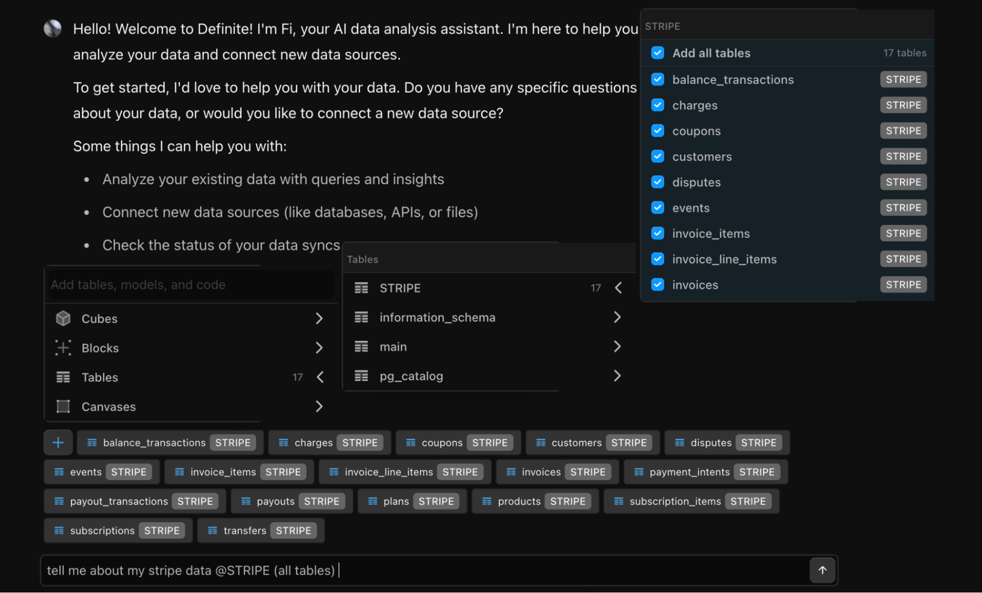
Pro Tip: If you want to be more precise, select individual tables in the list or start typing @ and you can autofill table names into context (or any other Definite data asset you choose.)
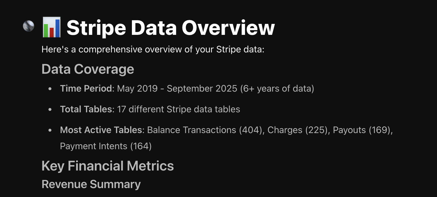
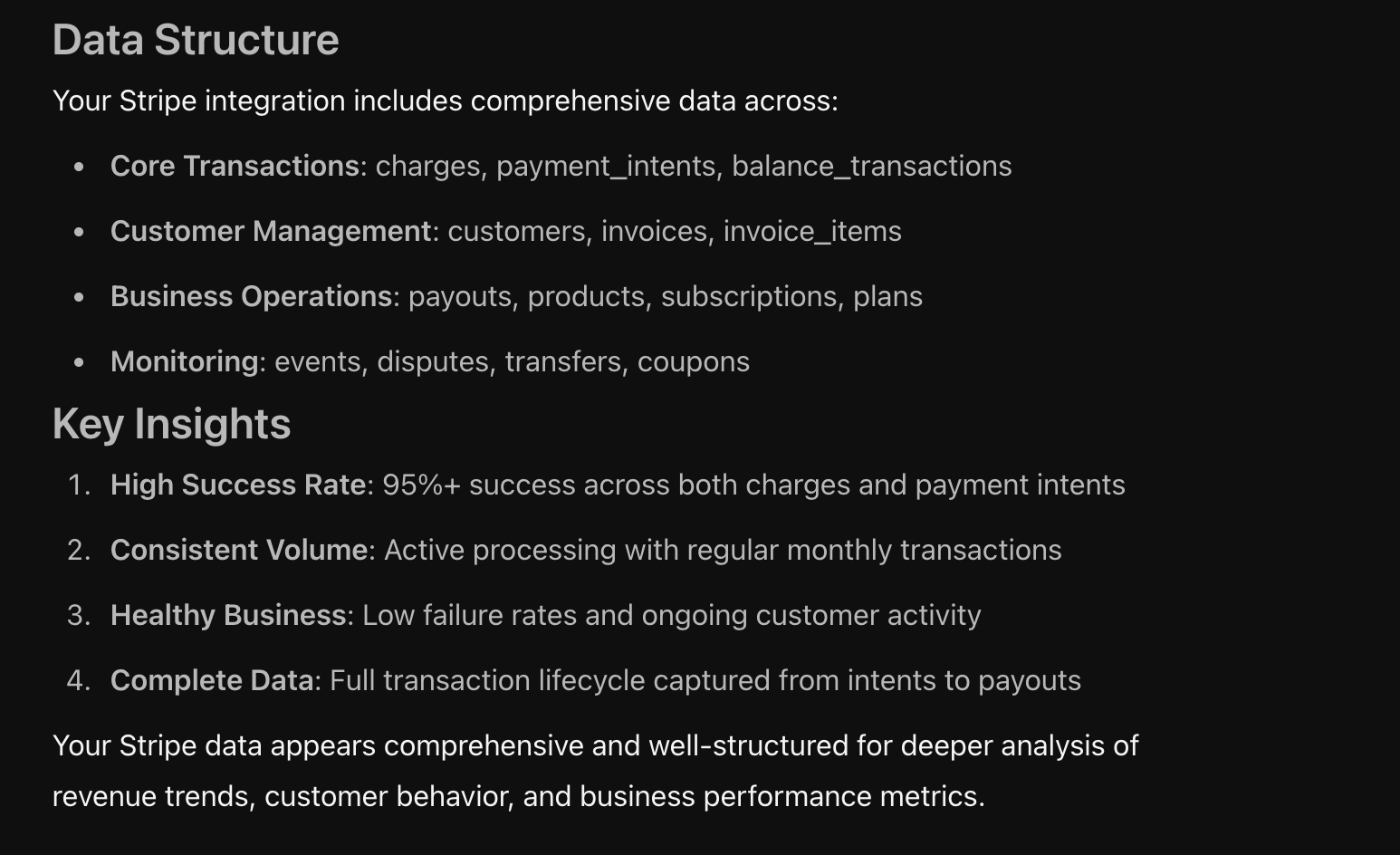
After a few seconds of exploring the tables, their columns and their contents (AKA running the queries you didn’t have to write), Fi returns a high-level summary. The summary includes basic account statistics, an overview of financial statistics, and a description of the tables and their contents.
Now that you know that Fi knows about your data, the next place people like to go is to check the metrics in Definite against the metrics they see in the source applications.
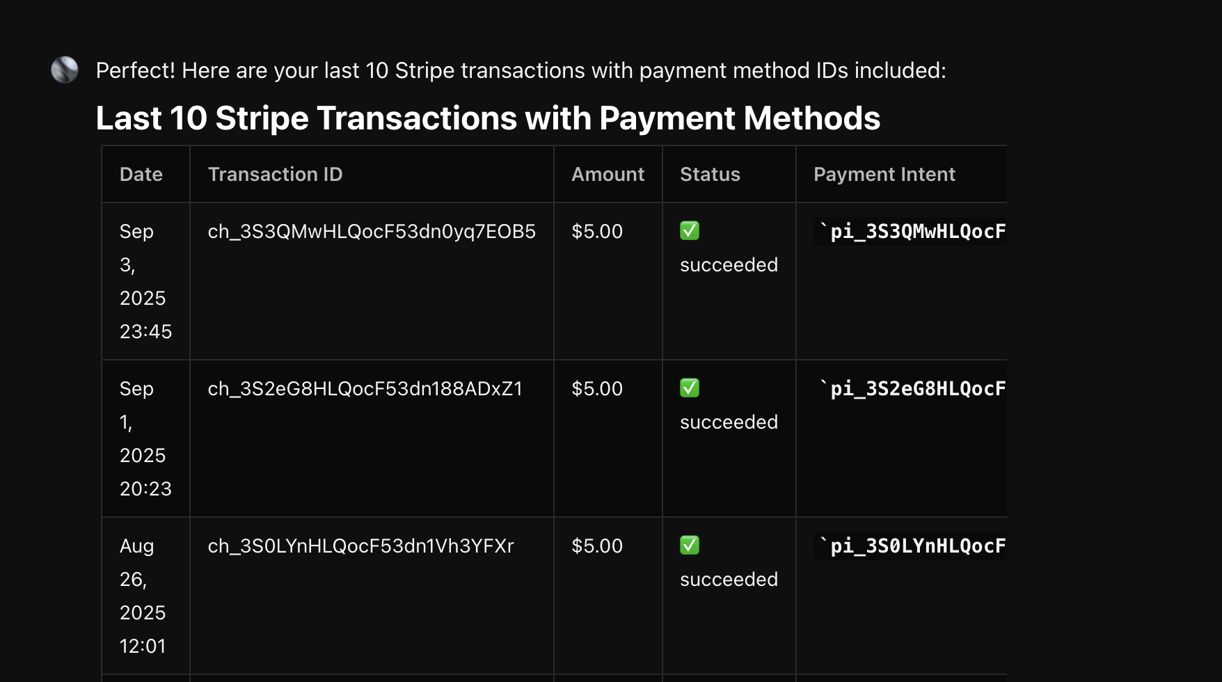
Show me my last 10 stripe transactions
The easiest way to check if everything smells right is to compare the tables in Definite against the tables in an application. Most of the time, this is a CRM like Hubspot, Salesforce, or Attio or a payments system like Stripe or Quickbooks.
Let’s see what it looks like in Stripe.
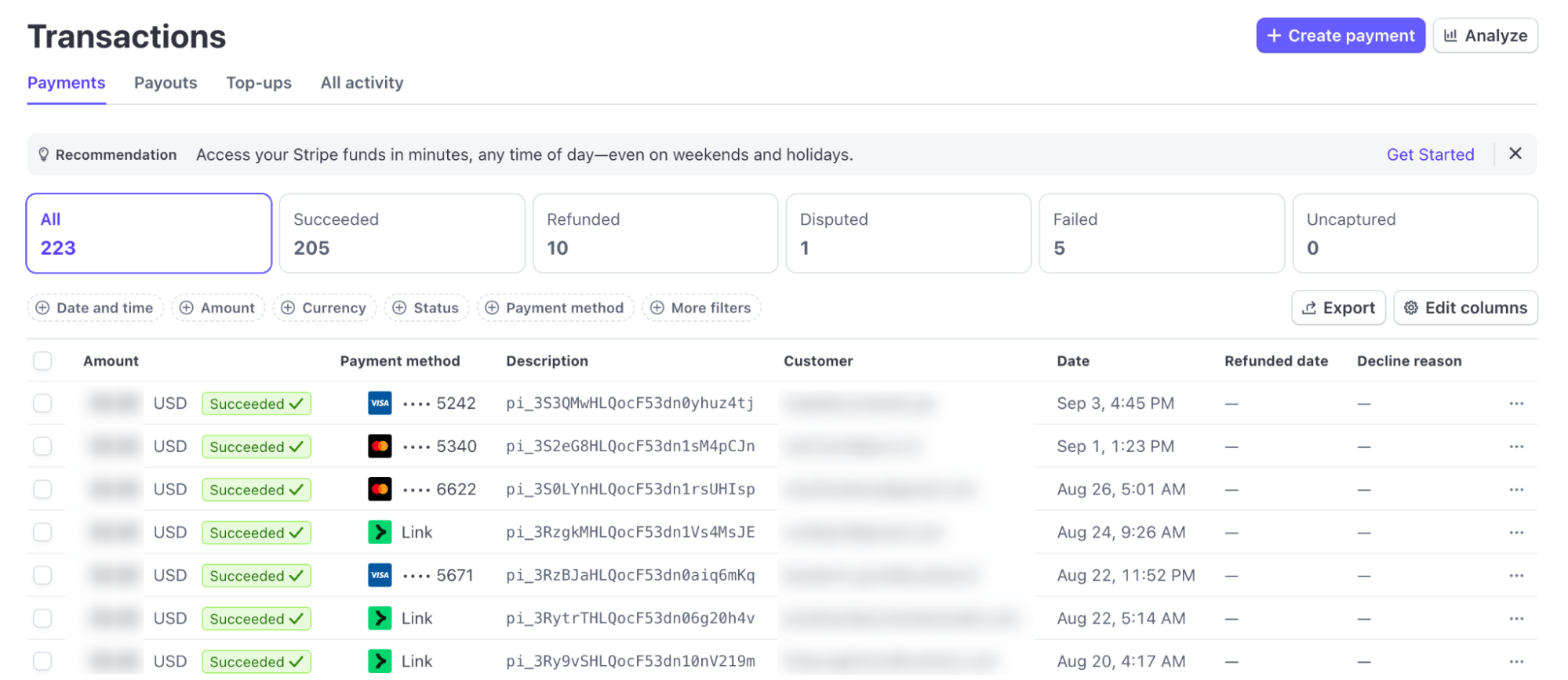
And let’s see what Fi provided. The data matches as expected. The only difference is that Fi returned the records with Charge ID instead of the Payment Method ID. A follow up prompt to “return those with the payment method ids eg pi_3S3QMwHLQocF53dn0yhuz4tj“ matched exactly what we saw in the dashboard.
Now that we’ve seen that Fi has the right data and knows how to work with it, let’s move on to something a bit more useful.
Ok Fi, SHOW ME THE MONEY!
Let’s have Fi provide the result that everybody wants to see (and is a premium Stripe feature for some reason!): our revenue charts.
This is where things get interesting—and a perfect example of why your role in bringing business context to an analysis is so important.
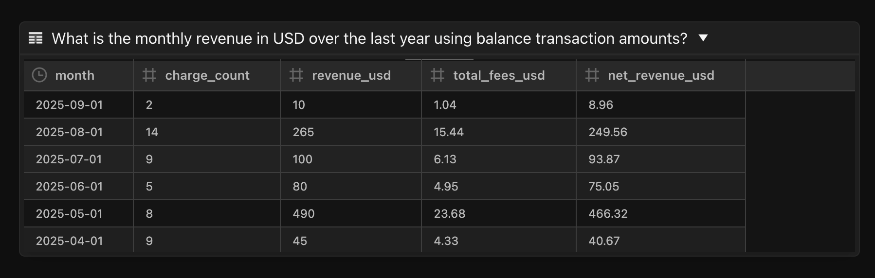
To track revenue over time, a good prompt would be: “give me revenue by month over the last year in USD.”
But, if you’re familiar with Stripe, you know that revenue is tracked from several different perspectives. There are charges, balances, payments, payment intents, and the list goes on. As a result, analyzing Stripe data can be a little tricky. So for the purposes of this tutorial, we’ll skip to the end first, then show you how we got there after that.
Ultimately, we arrived at our table, a clean report of revenue by month.
From there, it’s easy to put this into a chart by clicking the 🔲at the top right of the Fi chat, labeled, “Explore data in canvas” to open a new canvas. In the canvas view, you can click the two buttons at the top right corner of any table and add them to the canvas. The ➕sign adds the table as a table, and the button to its right adds it as a chart.
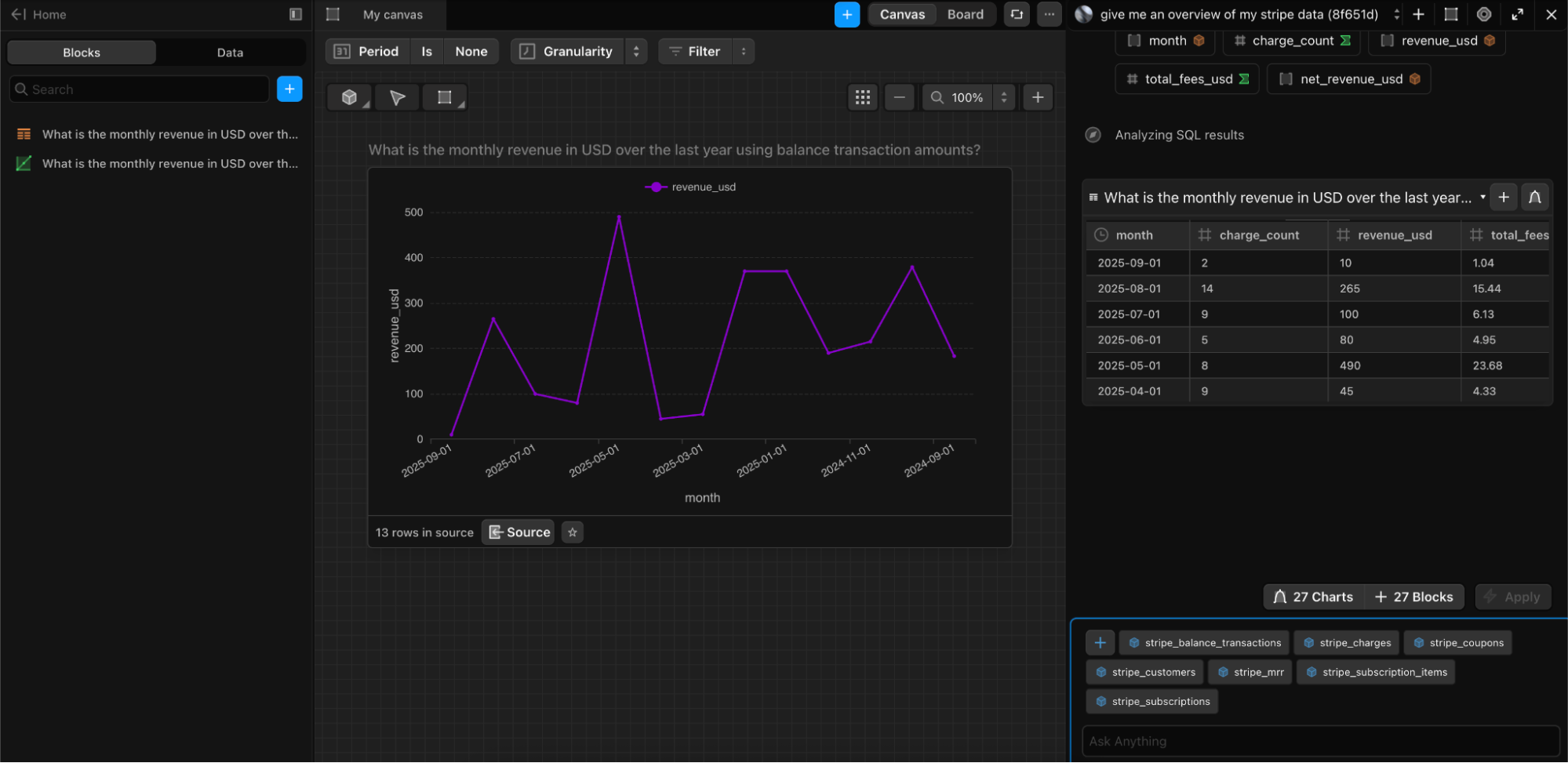
Now this chart is read for dashboard prime time.
Filling In the Gaps
Like any good cooking show, we fast forwarded through the chopping, sorting, and measuring to get to the good stuff. But in this case, there’s too much good stuff in the middle to leave it out. So how did we get there?
Initially, asking Fi for revenue yielded some numbers that were way off. Why? Because Stripe provides Charges data in the currency of the transaction. As a result, any transactions that happen in say, Indian Rupee (INR) will wildly inflate revenue numbers—but that’s exactly why we smell check.
Since we know we need to calculate exchange rates, the best next step is to ask Fi, “what tables have information about exchange rates?”
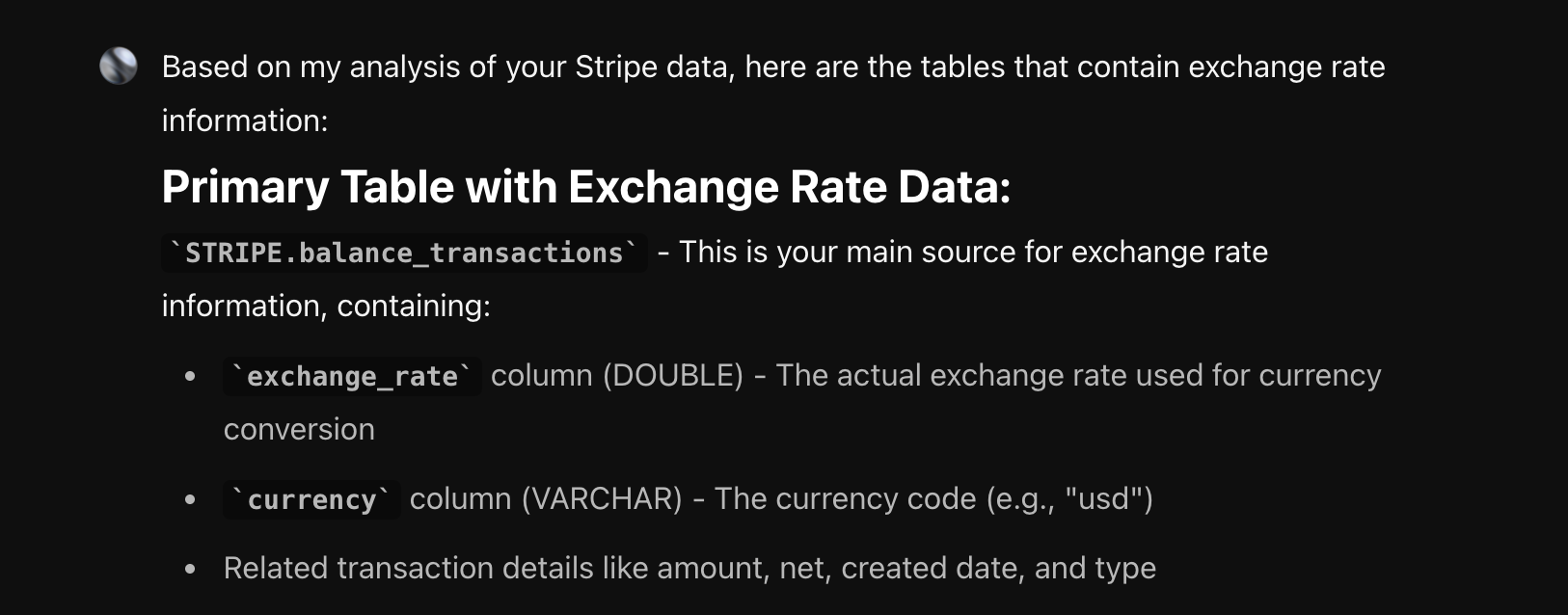
The next question is, of course, “can you use the @database.STRIPE.balance_transactions table to get the revenue in USD from the charges table?” The answer, as it turns out, is yes.
Knowing a little bit more about the data, adjusting the prompt to, “give me revenue by month over the last year in USD using the balance_transactions table to calculate exchange rates.”
One Last Tip For the SQL Pros
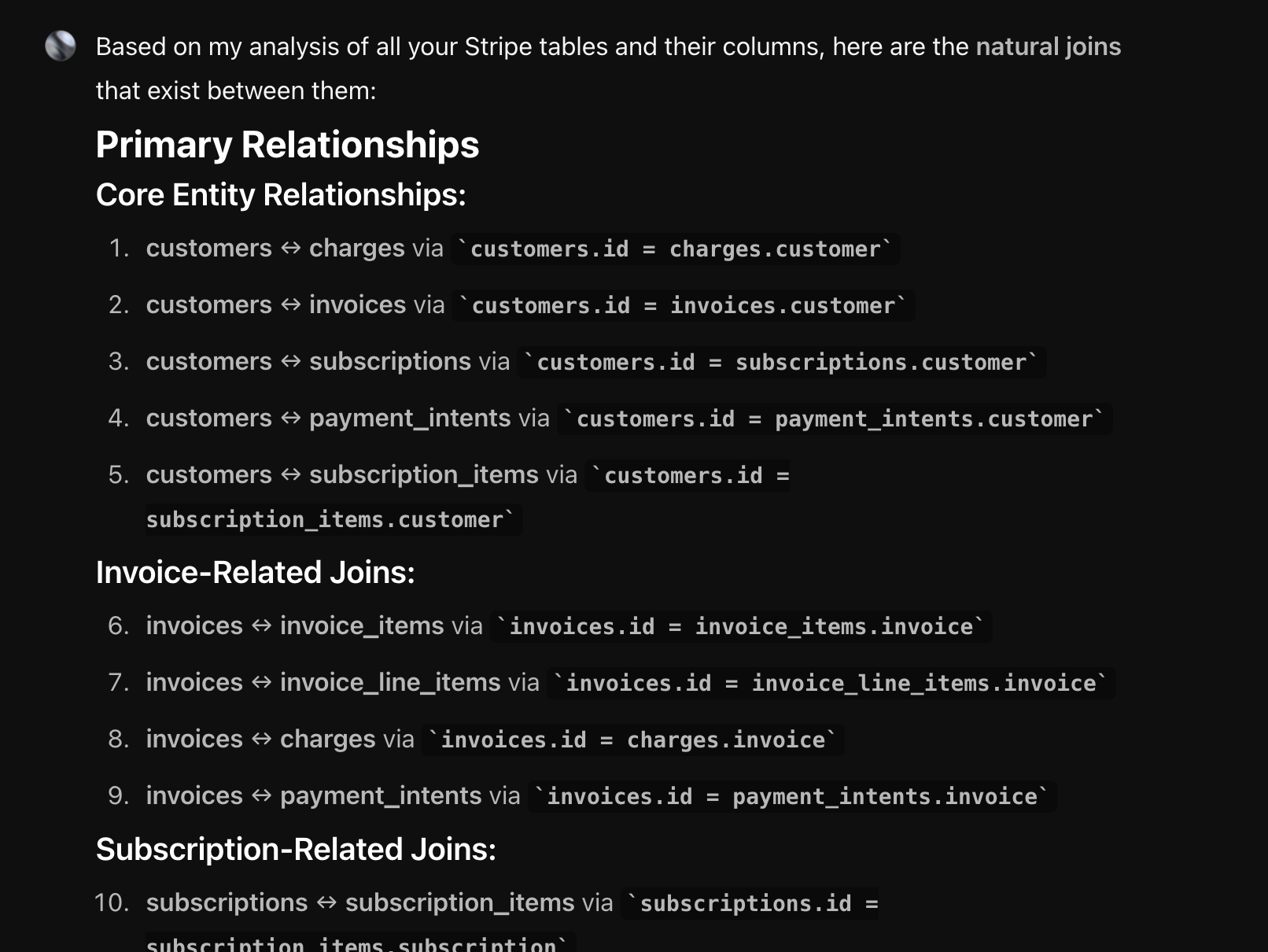
Any experienced analyst knows that discovering join relationships is a big part of becoming familiar with a new data set. This can be tedious at best and just shy of a root canal at worst. Here’s a trick that will change your life.
Ask Fi, "look at all the tables and their columns. Tell me if there are any natural joins between them." Seconds later, you’re done. Go have a nice lunch. You earned it.
Want to write your own semantic models in Cube? Now you have everything you need.
What could your data tell you?
Enter your domain and we’ll show you the business questions your tools can already answer — you just can’t ask them yet.
Try it with any company domain — no signup required.
Be a Good Human (In the Loop)
At the end of the day, Fi can do the heavy lifting—writing SQL, checking data quality, generating charts, surfacing insights in minutes. But she can’t replace your judgment. You know your business, your customers, and what “good” looks like.
Think of Fi as the sous-chef: she preps, slices, and stirs faster than anyone in the kitchen. But you’re still the head chef deciding what’s on the menu. When you pair her speed with your context, analytics finally delivers what it always promised—clear answers, real ROI, and a process that actually feels effortless.